INPUT TEXT
Input text material with gradient.
See the Pen Input Text Material with Gradient by Lucas Oliveira (@lucasyem) on CodePen.
Links
Made with
- HTML / CSS (SCSS)
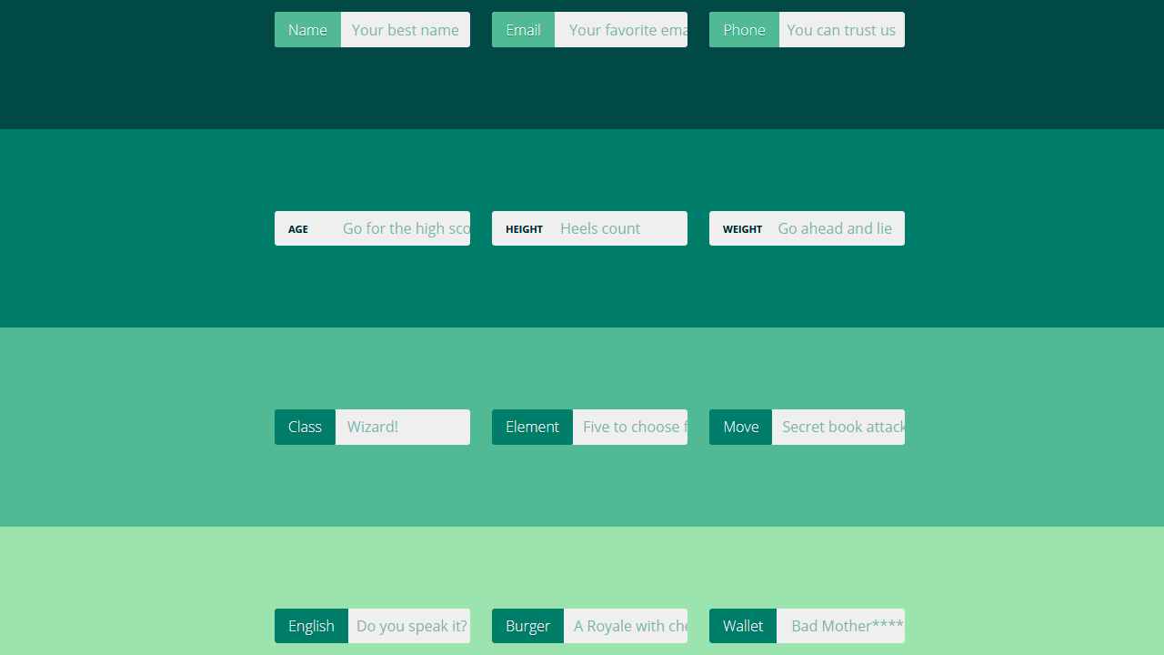
INPUT GROUP
Input group :focus-within.
See the Pen Input group :focus-within by Aaron Iker (@aaroniker) on CodePen.
Links
Made with
- HTML / CSS (SCSS) / JS
MATERIAL INPUT TEXT FIELDS
See the Pen Material Input Text Fields by Fatma (@fatmali) on CodePen.
Links
Made with
- HTML / CSS
JUMPING INPUT TEXT
See the Pen Jumping input text by Niklesh Tiwane (@nikstech) on CodePen.
Links
Made with
- HTML / CSS
FORM LABEL SHOW AFTER INPUT TEXT
Form label show after input text only CSS.
See the Pen Form label show after input text only CSS by Fidalgo (@fidalgodev) on CodePen.
Links
Made with
- HTML / CSS
NOTIFY ME
Form validation using HTML required and pattern attributes together with CSS :required and :valid selectors.
See the Pen Notify me by bertdida (@bertdida) on CodePen.
Links
Made with
- HTML / CSS (SCSS)
ELASTIC VALIDATION
See the Pen Elastic Validation [Google Chrome] by Andreas Storm (@avstorm) on CodePen.
Links
Made with
- HTML / CSS (Stylus)
INPUT:NOT(:PLACEHOLDER-SHOWN)
It looks kinda similar to the text inputs of the framework Materialize.
See the Pen input :not(:placeholder-shown) by Andreas Storm (@avstorm) on CodePen.
Links
Made with
- HTML / CSS (Stylus)
FORM INPUT DESIGN
Form input designs with hover and focus.
See the Pen Form Input Designs onHover and onFocus by MAHESH AMBURE (@maheshambure21) on CodePen.
Links
Made with
- HTML
- CSS (bootstrap.css)
INPUT FIELD GRADIENT BORDER FOCUS FUN
A gradient border on an input field that feathers out when focussed.
See the Pen Input Field Gradient Border Focus Fun by Rik Schennink (@rikschennink) on CodePen.
Links
Made with
- HTML
- CSS/SCSS
CSS ONLY FLOATED LABELS
A CSS only approach to the floated labels UI pattern.
See the Pen CSS Only Floated Labels by Nick Salloum (@callmenick) on CodePen.
Links
Made with
- HTML
- CSS/SCSS
CSS FIELDS
Fields with CSS custom properties.
See the Pen Field Animations with CSS Custom Properties by Stas Melnikov (@melnik909) on CodePen.
Links
Made with
- HTML
- CSS
INPUT FIELD WITH UNDERLINE UNDER EACH CHARACTER
Try deleting and writing something else in the input field. It uses the
chunit whose width is the width of the0character. It also assumes the font in theinputfield is a monospace one so that all characters have the same width. So the width for every character is always1ch. The gap between the characters is taken to be.5ch. This is the value we set forletter-spacing. Thewidthof theinputis the number of characters times the sum between the letter width (1ch) and the gap width (.5ch). So that’s7*(1ch + .5ch) = 7*1.5ch = 10.5ch. We remove the actualborderof theinputand we set a fake one using arepeating-linear-gradient. The dash (dimgrey) goes from0to1chand the gap (transparent) starts immediately after the dash and goes to1.5ch. It’s attached to the left and the bottom of the input – this is thebackground-positioncomponent (0%horizontally and100%vertically). It spreads across the entire input horizontally (100%in the ideal case, the input width minus the gap to take care of rendering issue in Chrome and Firefox) and is2pxtall – this is thebackground-sizecomponent of thebackground.
See the Pen input field with underline under each character by Ana Tudor (@thebabydino) on CodePen.
Links
Made with
- HTML / CSS (SCSS)
EMAIL INPUT FIELD
Just a nice little input field.
See the Pen Email Input Field by Dean Hidri (@visualcookie) on CodePen.
Links
Made with
- HTML / CSS (SCSS)
INPUT TEXT/PASSWORD ANIMATION
Only CSS input text/password animation.
See the Pen CSS3 Input Text/Password Animation by brayden cha (@chataehyeon) on CodePen.
Links
Made with
- HTML / CSS (SCSS)
MINIMAL MATERIAL DESIGN FORM INPUT
Super easy and fully scalable Material Design form input. Change one variable to change the size of everything.
See the Pen Minimal Material Design Form Input by Kyle Lavery (@kylelavery88) on CodePen.
Links
Made with
- HTML (Pug) / CSS (SCSS)
CSS-ONLY MATERIAL INPUTS
Inspired by Google’s Material Design guidelines for text fields.
See the Pen CSS-only Material Inputs by Lewis Robinson (@lewisvrobinson) on CodePen.
Links
Made with
- HTML (Pug) / CSS (SCSS)
WEBFLOW-STYLE EMAIL INPUT
Based on the input on https://webflow.com/cms. Changed to make use of pseudo elements and flexbox layout.
See the Pen Webflow-style email input by Phil Rose (@PRtheRose) on CodePen.
Links
Made with
- HTML / CSS (SCSS)
NICE, COMPLIANT INPUT BOXES
Nice input box with a lot of styling based on sibling selectors and psuedo classes. CSS only, and WCAG 2.0 AA compliant!
See the Pen Nice, compliant input boxes by Andrew Tunnecliffe (@atunnecliffe) on CodePen.
Links
Made with
- HTML / CSS
MATERIAL DESIGN INPUT TEXT
See the Pen Material Design Input Text by Ben Mildren (@mildrenben) on CodePen.
Links
Made with
- HTML / CSS (SCSS)
GOOGLE MATERIAL DESIGN INPUT BOXES
A CSS experiment to recreate the Google Material Design Polymer input boxes in CSS.
See the Pen Google Material Design Input Boxes by Chris on Code (@chrisoncode) on CodePen.
Links
Made with
- HTML / CSS
FANCY TEXT INPUTS
See the Pen Fancy Text Inputs by Alex Bergin (@abergin) on CodePen.
Links
Made with
- HTML / CSS (Sass)
ADAPTIVE PLACEHOLDER
Once activated, the input placeholders become input labels.
See the Pen Adaptive Placeholder by Danny King (@dannykingme) on CodePen.
Links
Made with
- HTML (Haml) / CSS (Less)
TEXT INPUT
I wanted to play with some
inputstyles that don’t rely on hover, don’t add clutter, show thelabelat all times, and showplaceholdertext when it is actually relevant.
See the Pen Text input love by Michael Arestad (@MichaelArestad) on CodePen.
Links
Made with
- HTML / CSS (SCSS)