PURE CSS CIRCULAR BORDER PATTERNS

The border patterns are created with clip-path on a pseudo-element.

See the Pen Pure CSS circular border patterns (1 element, no images) by Ana Tudor (@thebabydino) on CodePen.light

Author

  • Ana Tudor

Made with

  • HTML (Pug) / CSS (SCSS)

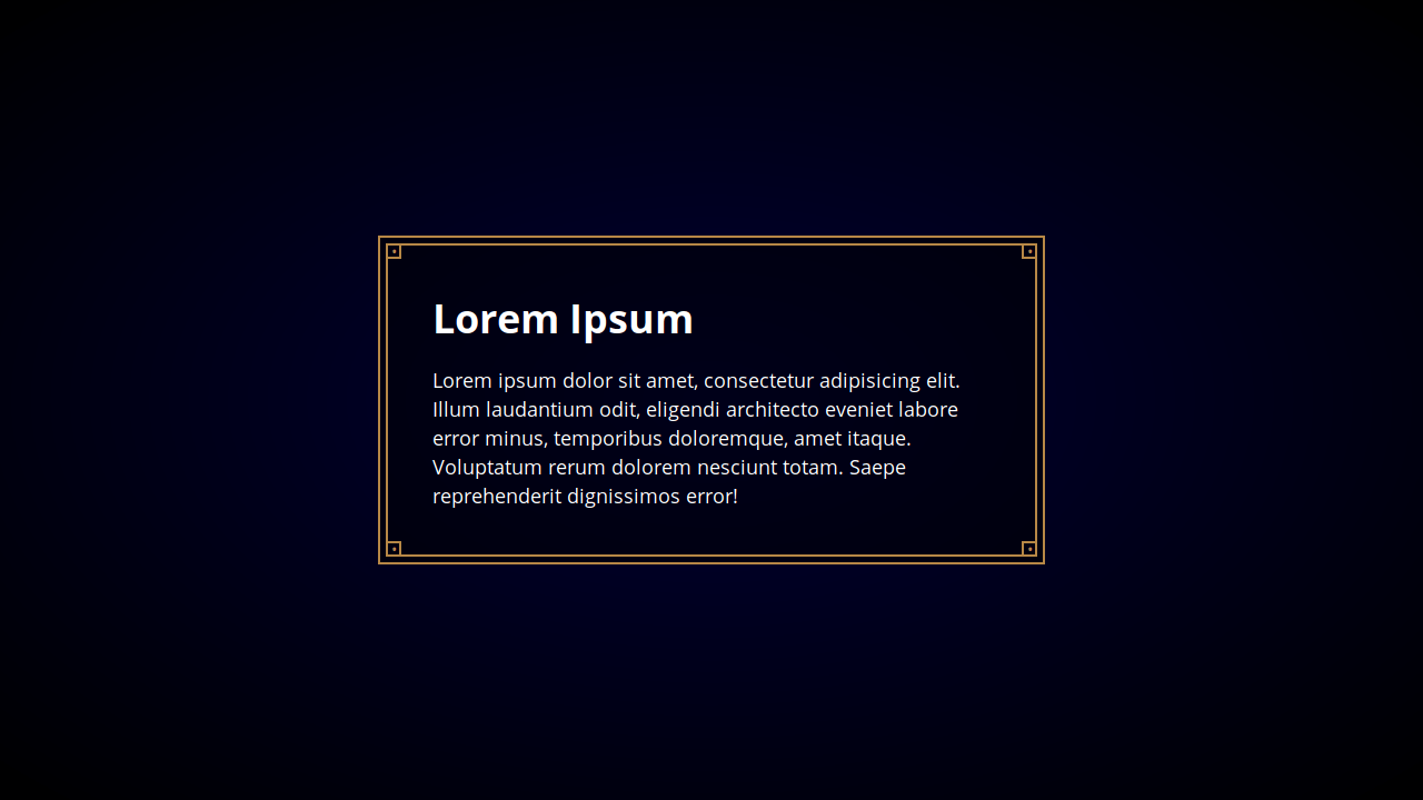
FITTED BORDER IMAGE THE EASY WAY

See the Pen Fitted Border Image the Easy Way by ShopTalk Show (@shoptalkshow) on CodePen.light

Author

  • ShopTalk Show

Made with

  • HTML / CSS (SCSS)

MAP-INSPIRED BORDER

Map-inspired border effect using stacked border & box-shadows. Single HTML element with CSS.

See the Pen Map-inspired border (single element + CSS) by Stephy (@blindingstars) on CodePen.light

Author

  • Stephy

Made with

  • HTML / CSS (SCSS)

BLURRED BORDER

See the Pen Blurred border by Ana Tudor (@thebabydino) on CodePen.light

Author

  • Ana Tudor

Made with

  • HTML / CSS (SCSS)

MAGIC BORDERS

Try to have a dynamic and responsive table that has borders only between cells.

See the Pen Magic borders by Saeed Alipoor (@saeedalipoor) on CodePen.light

Author

  • Saeed Alipoor

Made with

  • HTML / CSS (SCSS)

INTERACTIVE BUTTON BORDER

Button with an interactive border gradient.

See the Pen Interactive button border by Tobias Reich (@electerious) on CodePen.light

Author

  • Tobias Reich

Made with

  • HTML / CSS (SCSS) / JavaScript (Babel)

GRADIENT BORDER

HTML and CSS gradient border without pseudo elements.

See the Pen Gradient border without pseudo elements by Stefan Judis (@stefanjudis) on CodePen.light

Author

  • Stefan Judis

Made with

  • HTML / CSS (SCSS)

ROUNDED SIDE

See the Pen rounded side border radius by Joe (@joeashworth) on CodePen.light

Author

  • Joe

Made with

  • HTML / CSS

ANIMATED BORDER ON HOVER

Card with animated left border on hover.

See the Pen Card with animated left border on hover by Tony Phipps (@neutraltone) on CodePen.light

Author

  • Tony Phipps

Made with

  • HTML / CSS

SKETCHY BORDER

Using 8 border-radius values can be pretty dope. This example shows how using it on the element and its ::before pseudo element can create a sketchy look and feel.

See the Pen Sketchy border test by Andy Bell (@andybelldesign) on CodePen.light

Author

  • Andy Bell

Made with

  • HTML / CSS (SCSS)

CSS GRADIENT CLIP-PATH BORDERS

This example shows how the CSS clip-path property can be used to create a variety of shaped gradient borders.

See the Pen CSS Gradient Clip-Path Borders by George W. Park (@GeorgePark) on CodePen.light

Author

  • George W. Park

Made with

  • HTML / CSS

CSS GRADIENT ROUNDED BORDERS

This example shows how CSS gradients can be applied to a rounded border.

See the Pen CSS Gradient Rounded Borders by George W. Park (@GeorgePark) on CodePen.light

Author

  • George W. Park

Made with

  • HTML / CSS

BORDER INSET

Trying to achieve an inset border effect around a block of text.

See the Pen Reddit border inset challenge by David Darnes (@daviddarnes) on CodePen.light

Author

  • David Darnes

Made with

  • HTML / CSS (SCSS)

FANCY BORDER BOX

See the Pen Fancy Border Box by Max (@MyXoToD) on CodePen.light

Author

  • Max

Made with

  • HTML (Haml) / CSS (SCSS)

HAND DRAWN BORDER EFFECTS

A one line border-radius technique.

See the Pen Hand Drawn Border Effects by Tiffany Rayside (@tmrDevelops) on CodePen.light

Author

  • Tiffany Rayside

Made with

  • HTML / CSS

JAGGED BORDER

See the Pen Jagged border – top by HollowMan (@HollowMan) on CodePen.light

Author

  • HollowMan

Made with

  • HTML / CSS (Less)

8-BIT BORDERS USING SHADOWS

8-bit borders using multiple CSS3 shadows and a little of Sass.

See the Pen 8-bit borders using shadows by Alberto Para (@albpara) on CodePen.light

Author

  • Alberto Para

Made with

  • HTML / CSS (SCSS)

COMIC STYLE BORDER

See the Pen "comic style" border by michael picker (@mp) on CodePen.light

Author

  • michael picker

Made with

  • HTML / CSS

BORDER-RADIUS WEAVE

See the Pen Border-radius weave by uniphil (@uniphil) on CodePen.light

Author

  • uniphil

Made with

  • HTML / CSS (Sass)


Categorized in: