
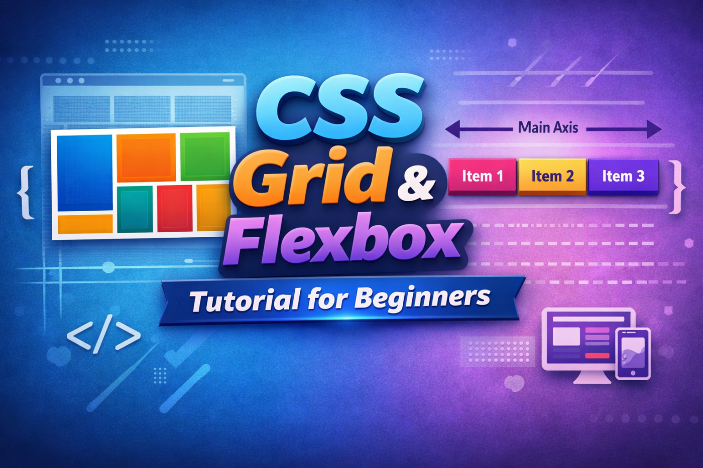

If you’re learning web development in 2026, one thing is clear:
👉 You must understand CSS Grid and Flexbox.
Without them, building modern, responsive websites is almost impossible.
In this complete CSS Grid & Flexbox tutorial for beginners, I’ll explain:
- What Flexbox is
- What CSS Grid is
- The difference between Grid and Flexbox
- When to use each
- Real practical examples
- Beginner mistakes to avoid
Let’s start from zero 👇
What is CSS Layout?
Before Flexbox and Grid, developers used:
- float
- inline-block
- tables
These methods were messy, hard to maintain, and terrible for responsive design.
Modern websites need:
- Mobile-friendly layout
- Clean structure
- Flexible alignment
- Easy spacing
That’s why Flexbox and CSS Grid were introduced.
CSS Flexbox Tutorial for Beginners
What is Flexbox?
Flexbox (Flexible Box Layout) is a one-dimensional layout system.
That means:
- It works in a row OR
- It works in a column
But not both at the same time.
It is perfect for:
- Navigation bars
- Buttons
- Card rows
- Centering content
How to Create a Flex Container
To use Flexbox, you simply write:
.container {
  display: flex;
}
Boom. 🎉
Now all child elements become flex items.
Understanding Main Axis & Cross Axis
This is where beginners get confused.
When you use:
flex-direction: row;
- Main axis → horizontal
- Cross axis → vertical
When you use:
flex-direction: column;
- Main axis → vertical
- Cross axis → horizontal
Understanding axis is the key to mastering Flexbox.
Important Flexbox Properties
1. flex-direction
flex-direction: row;
flex-direction: column;
flex-direction: row-reverse;
flex-direction: column-reverse;
Controls direction of layout.
2. justify-content (Main Axis Alignment)
justify-content: center;
justify-content: space-between;
justify-content: space-around;
justify-content: space-evenly;
This aligns items along the main axis.
3. align-items (Cross Axis Alignment)
align-items: center;
align-items: flex-start;
align-items: flex-end;
This aligns items vertically (or horizontally depending on axis).
4. flex-wrap
By default, flex items stay in one line.
To wrap:
flex-wrap: wrap;
This is extremely important for responsive layouts.
5. flex Property (Grow, Shrink, Basis)
flex: 1;
This makes items equally share space.
This is commonly used in:
- Pricing sections
- Equal width cards
- Dashboard layouts
Practical Flexbox Example: Center a Div Perfectly
Want to center something perfectly?
body {
  display: flex;
  justify-content: center;
  align-items: center;
  height: 100vh;
}
That’s it. No hacks. No margin tricks.
Flexbox made centering simple.
CSS Grid Tutorial for Beginners
Now let’s talk about the real game changer 👇
What is CSS Grid?
CSS Grid is a two-dimensional layout system.
That means it works in:
- Rows AND
- Columns
At the same time.
This makes it perfect for:
- Full page layouts
- Magazine layouts
- Admin dashboards
- Complex UI designs
How to Create a Grid Container
.container {
  display: grid;
}
Now you can define rows and columns.
grid-template-columns
grid-template-columns: 200px 200px 200px;
Or better:
grid-template-columns: repeat(3, 1fr);
This creates 3 equal columns.
Understanding the fr Unit
fr means “fraction”.
Example:
grid-template-columns: 1fr 2fr;
Second column is twice the size of first.
This makes responsive layout much easier.
grid-template-rows
grid-template-rows: 100px auto 200px;
Defines height of rows.
Gap in Grid
Instead of margins, Grid gives us:
gap: 20px;
Or:
row-gap: 20px;
column-gap: 10px;
Much cleaner than margin hacks.
Positioning Items in Grid
You can manually place items:
grid-column: 1 / 3;
grid-row: 1 / 2;
This means:
- Start at column line 1
- End at column line 3
Grid gives you full control.
grid-template-areas (Super Powerful)
You can name areas like this:
grid-template-areas:
  "header header"
  "sidebar content"
  "footer footer";
This makes layout readable and clean.
Perfect for beginners building full websites.
Flexbox vs CSS Grid – What’s the Difference?
This is the most searched question.
Here’s the simple answer:
| Flexbox | CSS Grid |
|---|---|
| One-dimensional | Two-dimensional |
| Best for small layouts | Best for full layouts |
| Align items in a row or column | Control rows & columns together |
When to Use Flexbox
Use Flexbox for:
- Navbar
- Buttons
- Cards in a row
- Aligning elements
- Centering content
When to Use Grid
Use Grid for:
- Website layout
- Blog structure
- Dashboard
- Image gallery
- Complex designs
Pro Tip: Use Both Together 🚀
Professional developers don’t choose one.
They combine both.
Example:
- Use Grid for overall page layout
- Use Flexbox inside grid items
That’s how modern websites are built.
Responsive Design with Flexbox & Grid
To make layouts responsive:
@media (max-width: 768px) {
  .container {
    grid-template-columns: 1fr;
  }
}
For Flexbox:
@media (max-width: 768px) {
  .container {
    flex-direction: column;
  }
}
Always think mobile-first.
Common Beginner Mistakes
- Not understanding main axis
- Mixing up justify-content & align-items
- Using Grid for simple tasks
- Not using flex-wrap
- Ignoring responsive testing
Avoid these and you’ll improve fast.
Mini Project Idea for Practice
Build this:
- Header
- Sidebar
- Main content
- Footer
Use:
- Grid for layout
- Flexbox for navigation
- Responsive media queries
This one project will teach you everything.
Final Thoughts
If you’re serious about becoming:
- Frontend developer
- Full stack developer
- UI engineer
- Freelance web designer
Then mastering CSS Grid and Flexbox is non-negotiable.
Flexbox gives you alignment power.
Grid gives you layout control.
Together, they give you complete freedom.

